

How do you tell an app it's time to go?
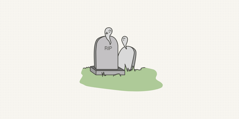
My grandmother pays los muertos.
That's what we call it at home. A funeral insurance policy. She took one out for every single person in the family the moment we were born. Me, my cousins, all of us. Decades of small monthly payments for a service nobody ever wants to cash in.
We tease her about it constantly. "Abuelita, stop thinking about that." "You're being dramatic." "We're not going anywhere."
She never argues. She just gives the same answer every time: this way it's all taken care of for when the inevitable happens.
And she's right. Quietly, annoyingly, completely right.
The fun part
I build a fitness app called FitWoody. Most of the time, I get to think about the fun stuff.
The features people screenshot. The ones that look good in a launch video. In 2.5 we shipped a flyover that replays your ride from above, and I won't pretend I haven't watched my own routes more times than I'd admit.
That's the part of app development everyone signs up for. New things. Shiny things. The stuff that makes someone stop scrolling.
Nobody gets into this to build the other stuff.
The part nobody screenshots
Here's something they don't tell you when you ship your first app: every app that lives long enough starts to collect ghosts.
Old versions. Versions running on phones you forgot existed. Versions that worked perfectly in 2021 and now quietly break the moment you touch the backend.
On the web, this is a non-problem. You fix it, you deploy, everyone gets the fix on their next refresh. Done.
On native apps, it's a different sport. The user has to update. And sometimes they won't, or they can't, or they updated one device and not the other, or their phone is too old to even install the thing you just released.
So eventually you need to be able to say things to people. Specific, awkward things:
- There's a new version, you should probably update.
- Your version stops working in a few days.
- Your version no longer works, you'll need to update to keep going.
- One of your other devices already updated, and now they don't speak the same language.
- There's a new version, but your phone is too old to install it.
Each of those lives at a different point in the life of a release. Each one needs its own tone, its own screen, its own moment. It isn't a notification. It's a whole little system that sits there doing almost nothing, waiting.
We even use her word for it, more or less. When a version reaches the end, we sunset it. We let it die.
The part we actually agonized over
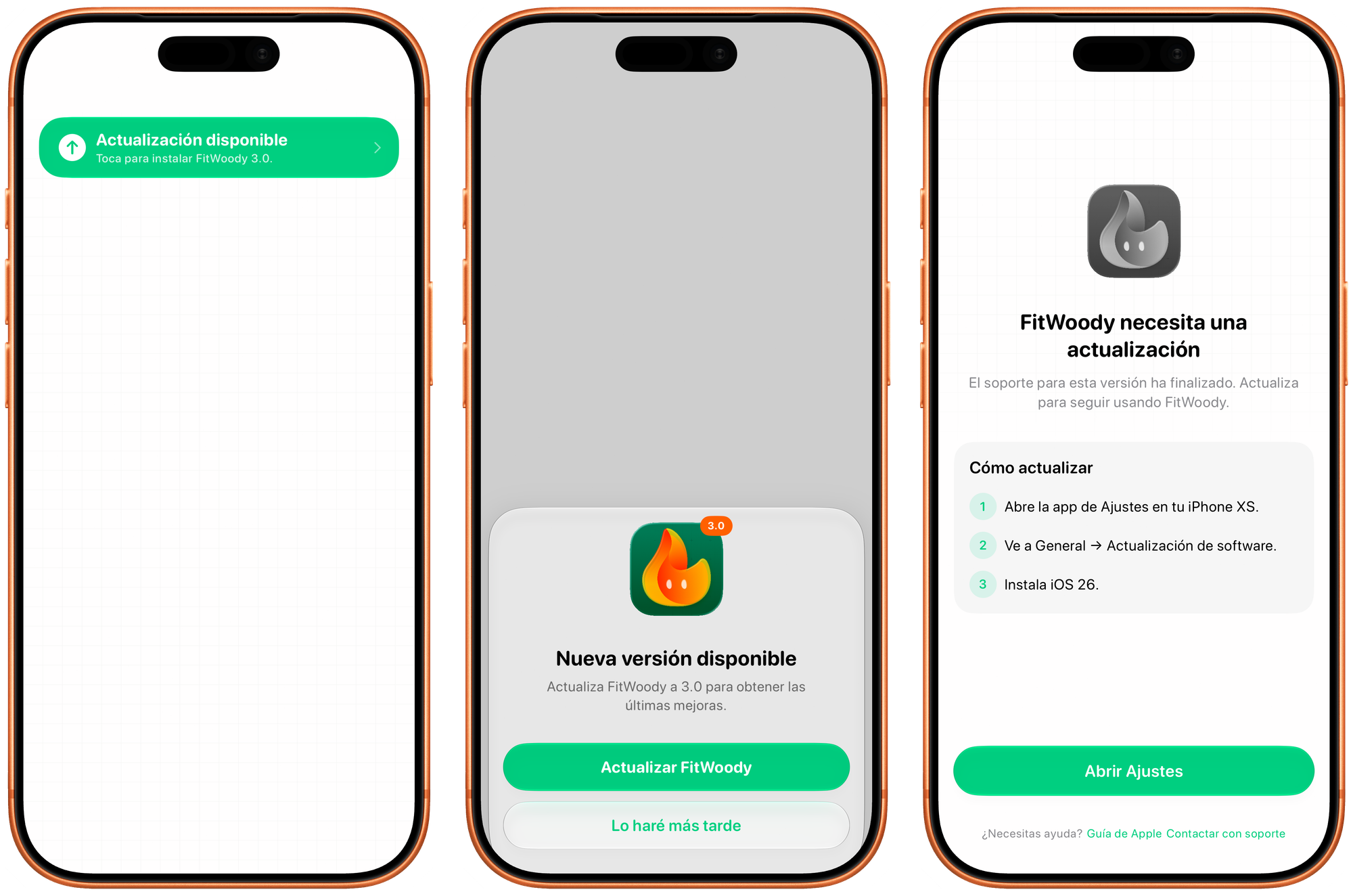
Under the hood it's mostly logic. On the surface it's three screens, each one a little louder than the last, and getting the tone of each one right took more debate than I'd like to admit.
First, the sheet. The polite tap on the shoulder. There's a new version, here's roughly what's in it, update now or later. Easy to dismiss, because at this point it honestly doesn't matter much.
Then, if you keep putting it off, something quieter but more stubborn: a banner in Settings, with a little badge on the open settings button. It never interrupts you. It just sits there, the way a sticky note sits on the fridge, until you deal with it.
And finally, when your version actually stops working, the locked screen. The app won't let you carry on, because carrying on would mean writing your data into a version we can no longer keep in sync.
Here's the part I care about most. Even on that locked screen, you're never trapped. You can still cancel your subscription. You can still delete your account. You can still take your data and walk away. Locking the features is one thing. Locking you in would be something else entirely, and we weren't willing to build that.
The same instinct runs all the way down. If our own servers have a bad moment and the version check fails, we let you straight in. We're not going to hold your workouts hostage over a problem on our end.
How it knows when to speak up
The screens are the easy half. The harder half is timing: noticing that something changed, and then deciding whether that something is actually worth interrupting you over.
Start with noticing. Your account can live on more than one device, and they need to agree on reality. So instead of only checking for updates when you open the app, we watch for changes as they happen. If your iPad updates to 3.0 while your iPhone is sitting open on the table, your iPhone finds out within about half a second. No relaunch, no pull to refresh. It just knows.
(There's a small subtlety: those changes tend to arrive in bursts, several at once, so we wait half a second of quiet before reacting. Otherwise one update could fire the same check five times in a row.)
Then the harder question. Now that we've noticed, do we actually say anything?
This is the part I'm quietly proud of. The naive approach is to remember which version you dismissed. "User said no to 3.0," done. But that breaks the moment the situation shifts. You dismiss the prompt while you're on a single device, then your iPad updates, and suddenly your phone is out of sync, for a completely different reason, on the very same version number.
So we don't remember the version. We remember the reason. Every situation that could trigger a prompt gets boiled down to a short fingerprint:
kind=optional | os=ok | otherDevices=none | version=3.0.0
kind=optional | os=ok | otherDevices=one  | version=3.0.0
Two different fingerprints. If the reason changes, the fingerprint changes, and we ask again, because now there's genuinely something new to tell you. If nothing meaningful moved, the fingerprint is identical, and we stay quiet. "Should I bother this person?" becomes a one-line string comparison.
The countdowns get the same treatment. "Expires in X days" would change every midnight, so instead of exact days we group time into chunks: more than a month, a couple of weeks, a few days, tomorrow. The warning only comes back when you cross into a more urgent chunk. 29 days to 28 says nothing new. 14 to 13 does.
Listen to your grandmother
We just started the road toward FitWoody 3.0, which we want to ship in September. Big release. Backend changes. The kind of update where, if someone stays behind on an old version, things can go wrong in ways they'd never notice until it's too late.
So before any of the exciting 3.0 work, we sat down and built this first. The boring thing. The whole unglamorous machinery for telling a version, gently, that its time is coming.
Nobody asked for it. No user will ever screenshot it. It will sit there, mostly silent, for months.
And then one day something will break, or a version will have to go, and it will all already be handled. For when the inevitable happens.
I spent years being the kid rolling his eyes at the insurance. Turns out I just hadn't met my own version of los muertos yet.
She wasn't being dramatic. She was doing maintenance on the future. The old folks usually are.
P.S. I still left things out: the check that has to run before you've even logged in, and the fact that the whole decision engine is one pure function with a small army of tests behind it, so when I break it, the tests scream instead of your phone. Another day.
Member discussion